treks
Treks is an application and responsive companion website prospective project that parks can us to help their visitors plan their hikes and navigate on their trails. It provides users an easy way to donate to the trails they love, and provide feedback on problems with the trail that park workers can address. Treks was built for the completion of the Google UX Certificate program.
_edited.png)
_edited.png)
Hearing from hikers
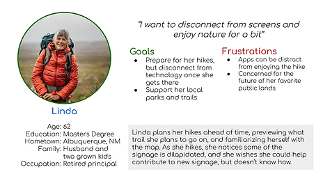
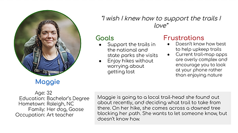
I interviewed hikers of various ages and experience levels to understand their current hiking experience, and opportunities to improve it, while helping the parks they love. I used these interviews to identify reoccurring themes and develop personas to inform my designs. Linda represents a user that may benefit more from, or prefer a desktop site, while Maggies goals align more with a mobile app.
Defining the problem
Through my research, I learned that in addition to research and navigation of trails, users were frustrated with dilapidated trails, and wished they could be part of the a solution.
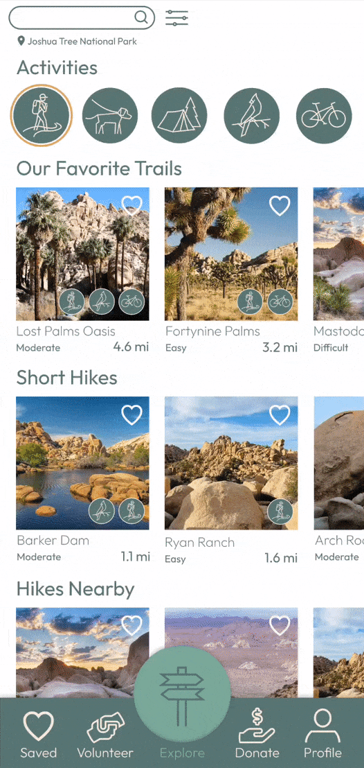
Mobile-first
Iterate, Iterate, Iterate
After a round of crazy eights and other ideation, I began creating wireframes. I created many versions of each page and refined them into a set of low-fidelity digital wireframes.

I decided a mobile-first design would allow me to explore all necessary features of the product, chiefly navigation, while keeping the design streamlined. The responsive site would act more as a companion, offering a larger interface for researching and planning out hikes, as well as providing another location for donations.
Prototyping
From these wireframes, I created a lo-fi prototype to prove out my planned user flow, and allow for usability testing.

Research
Using the lo-fi prototype, I performed an unmoderated usability test where users chose a trail, navigated the trail, reported a problem on the trail, and gave a donation to the park.
1
Finding
Users were concerned that they may not have service to report a problem on the trail, or may have taken a picture earlier to report.
2
Finding
Users were unsure what their donations were contributing to.
3
Finding
Users wanted to be able to save from multiple locations.
Improvements


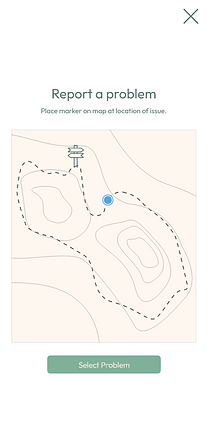
The main source of concern was over the process of reporting a problem on the trail. Users pointed out that they sometimes did not have service on the trail, and may need to take a picture first, and upload it later. One way this problem was addressed was to add an upload button to the camera screen, allowing users to upload a photo from their camera roll, instead of using the in-app camera.
In addition to uploading a picture separately, users said they may not want to stop to report the problem on the trail, or could be unable to due to lack of service. In order to address this possibility, I added another path to report issues, allowing users to issue a report after their hike, and drop a pin to estimate the location on the trail.


A major concern revealed in testing was that users were confused as to whether their donation was going to the parks, or to the app. It is extremely important to be transparent, and maintain user's trust.
Prototyping Round 2
After usability testing and several rounds of adjustments, I created a final hi-fi prototype of the mobile app.
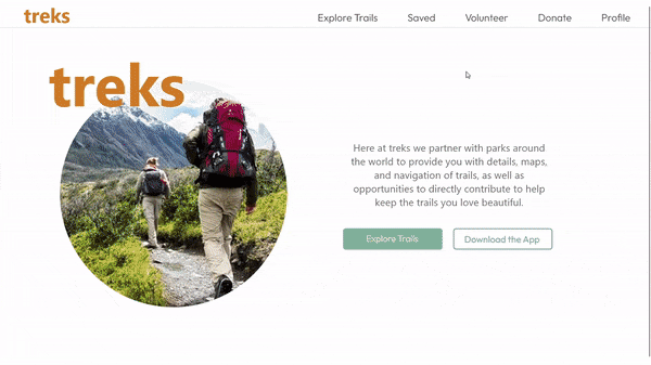
Responsive Website
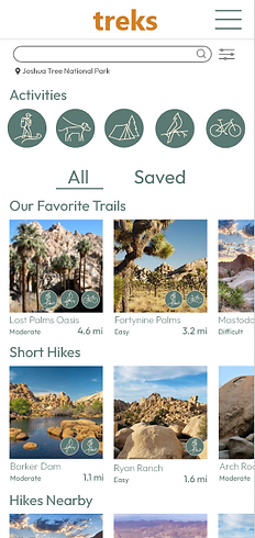
After working through hiccups in the user flow, I moved to designing a desktop and mobile version of a companion website. With a UI language and sticker sheet established, I was able to efficiently move from paper wireframes directly to hi-fi mockups. This website focuses on research of trails and donations.
_edited.png)


Adjusting to the format
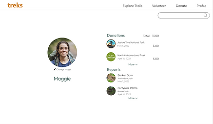
Some features were adjusted to take advantage of a larger format. Instead of splitting the profile into reports and donations, both are represented on screen.


Responsive Site Mockups


Prototypes
Mobile App
Desktop Site