Flashback Cinemas
As part of the Google UX Design Certification program, I was challenged to create a ticketing system user flow for a movie theater. I was the sole researcher and designer for this project, as well as creating the logo and branding.
Talking with users
I started out by interviewing users to identify opportunities for improving the movie-going experience. I wanted to look holistically at the whole experience rather than just the ticket purchasing process to find any opportunities to improve the experience of the user. I conducted user interviews, which I used to find common pain points and opportunities using empathy mapping.
The Current Process
Planning a trip to see a movie with a group can be a frustrating process.
Buy Tickets
After deciding on a movie to see, either one person is tasked with buying the tickets for the entire group, or a section of seats is chosen, and a series of texts are sent, trying to make sure everyone gets the right seats.
Payback
If you were the one chosen to buy your group's tickets, now it's time to get your money back. That means multiple text messages, requests on Venmo and CashApp, and pestering your friends to hopefully get paid back.
It's Waiting Time
Although you already have your tickets, you still have to wait if you want popcorn while you watch the movie.
Enjoy the Show!
After all that, it's finally time to relax with friends and enjoy the show.
Findings: Pain Points
Group Ticketing
Users buying tickets for groups have to buy all the tickets themselves, and turn to services like Venmo to hopefully get repaid.
Waiting in line
Despite having pre-purchased tickets, customers have to wait in line to purchase food and drink, leading them to have to show up early, or potentially be late to the start of the movie.
Showtime Visibility
While most users knew ahead what movie they were seeing, and were happy to select the movie to view showtimes, some “power users” wanted to be able to view all showtimes in one place in order to choose what movie worked with their schedule.
I found that the modern ticketing systems to pre-purchase tickets were convenient, but some were frustrated that despite already having their ticket, they still had to wait in line for popcorn and drinks. Many users also use seeing a movie as a social outing and want to sit together with their groups. Purchasing tickets for these groups can be a frustrating process to navigate, with either one person having to buy all the tickets, or having to coordinate to all buy tickets at the same time so that seats are not taken by others.
The Problem
Movie Theater ticketing systems can be complex and difficult to navigate, and provide no method for groups seeing a movie together to buy tickets individually. Although ticket pre-purchase can be convenient, when users have to wait in line to get food anyway, some of that convenience is negated.
The Goal
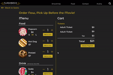
Design a movie ticketing user flow that provides multiple ways to easily find a movie to see, and leads the user through the ticket buying process seamlessly. Also to provide a method of simplifying the group ticket buying process. Provide a way for users to pre-purchase food and drink so they are able to walk into the theater, show their ticket, gran their popcorn and drink, and enjoy the movie!
Sitemap
With reserving tickets and purchasing food, the website is fairly complex in its functionality. This made it even more important to have a clear, concise user flow. Outlining a sitemap allowed me to quickly create and iterate the best user flow.

Iterate, Iterate, Iterate
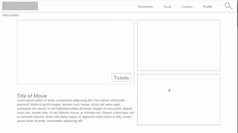
Using my sitemap as a reference, I created quick paper wireframes, testing a lot of ideas, deciding what elements worked best, and combining them to create an initial design of each major screen.
_edited.jpg)

_edited.jpg)
_edited.jpg)

After combining the elements into initial wireframes, I then created modified wireframes of each major screen to accomodate the use of smaller devices, such as phones.

Moving from paper to digital wireframes helped me better visualize size constraints and I started to simplify the amount of information presented on each screen.
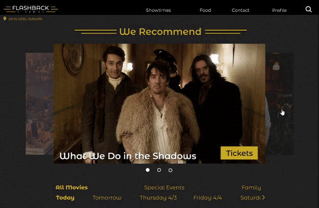
I first included a brief description of a featured movie, as well as space to feature other films or promotions.

A simple filter allows users to narrow their search to movies that will work for them.

Users can either buy all selected seats, or send them to a group to be purchased
Prototyping
I then went on to create a prototype from the wireframes, which I then used to conduct usability studies.
Testing, 1, 2, 3
Before creating a more high-fidelity design, I knew I needed to make some adjustments. I ran a series of usability studies to determine the best path forward. I ran moderated usability studies where each participant completed the user flow, commenting as they went, and filled out a survey afterwards.
Pop-ups during checkout process interrupted linear flow.
Users really liked being able to pre-purchase food and beverage, so making this as streamlined as possible is important
Inconsistency between content filters on the Showtimes page vs the main menu was confusing
Adjustments
After running usability studies, I moved to creating high fidelity mockups of my design, incorporating changes to address the findings from the usability study.
Before

After

The popup left users confused as to whether they were about to complete the checkout process, or if there would be more steps to the process. A separate screen allows users to choose their payment, and then complete the checkout.
Before
Before

After
After

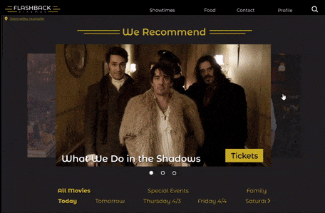
I simplified the main screen to a single carousel, removing redundant descriptions and de cluttering the page
Before

After
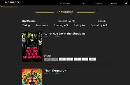
In order to create more cohesion within the website, I changed the content filter to more closely match the filter on the main page. I also adjusted the layout to allow for the use of the official movie poster, rather than the same still from the main page
Reponsive Design
I created alternate versions of the mockups so that the website would operate seamlessly whether using a computer, or mobile device


Putting it all together
After creating an initial hi-fidelity prototype and running a second round of usability studies, I made adjustments to the design and created this prototype. A feeling of continuity and cohesion was very important for this user flow, so care was taken to make motion and transitions enhance the design. For instance, when clicking "Tickets" rather than the name of a movie, users are automatically scrolled down to the seat selection section of the film page in order to streamline the ticketing process.
If you would like to experience this ticketing process, please feel free to check it out yourself!