Phat Sammy's Mobile Menu and Payment System.
As part of the Google UX Design Certificate course, I created a mobile menu and payment system for a local restaurant and tiki bar
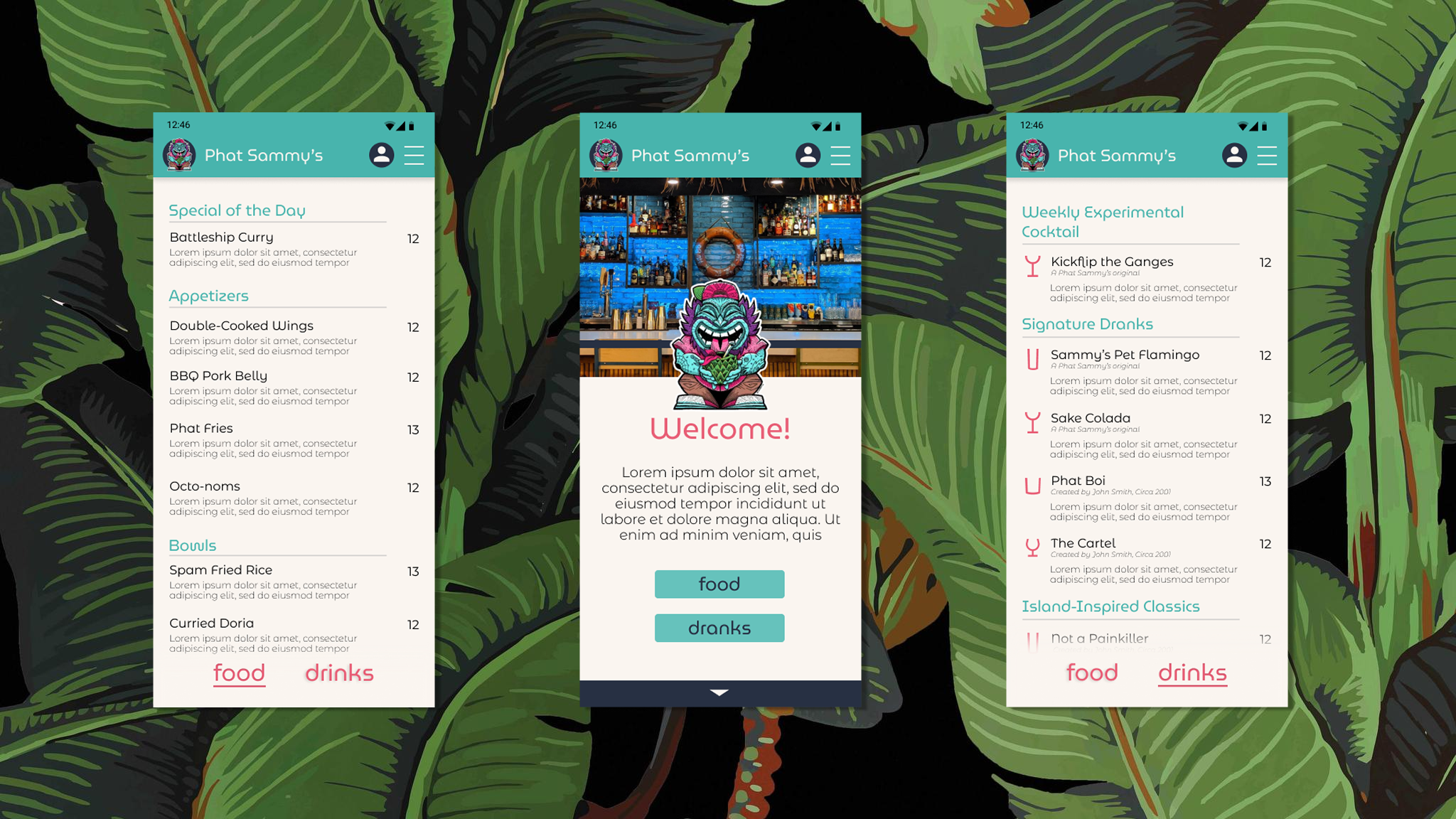
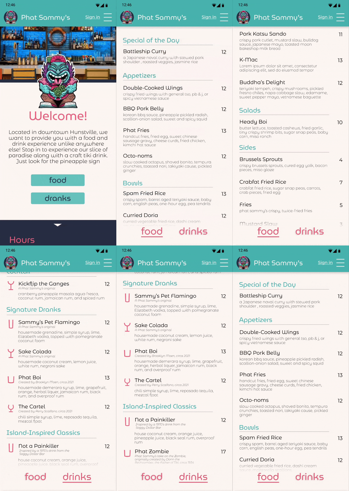
As part of the Google UX Design Certification program, I created an app for the local restaurant and tiki bar Phat Sammy's. This app incorporates an updated mobile menu and payment system. The payment system allows for users to split checks quickly and easily, and pay via Google Pay or a saved card.
Mobile menus can be tough to navigate and splitting a bill can lead to confusion and inaccurate bills.
The Problem
Create an app that allows users to quickly and easily choose a food and beverage to order, split a check, and pay for their meal.
The Goal
User Research
I conducted user research by conducting in-person interviews of restaurant customers. I tried to limit bias through selecting a wide range of users to interview. Users had a wide range of age, abilities, experience with mobile menus, and experience with mobile payment.
Pain Points
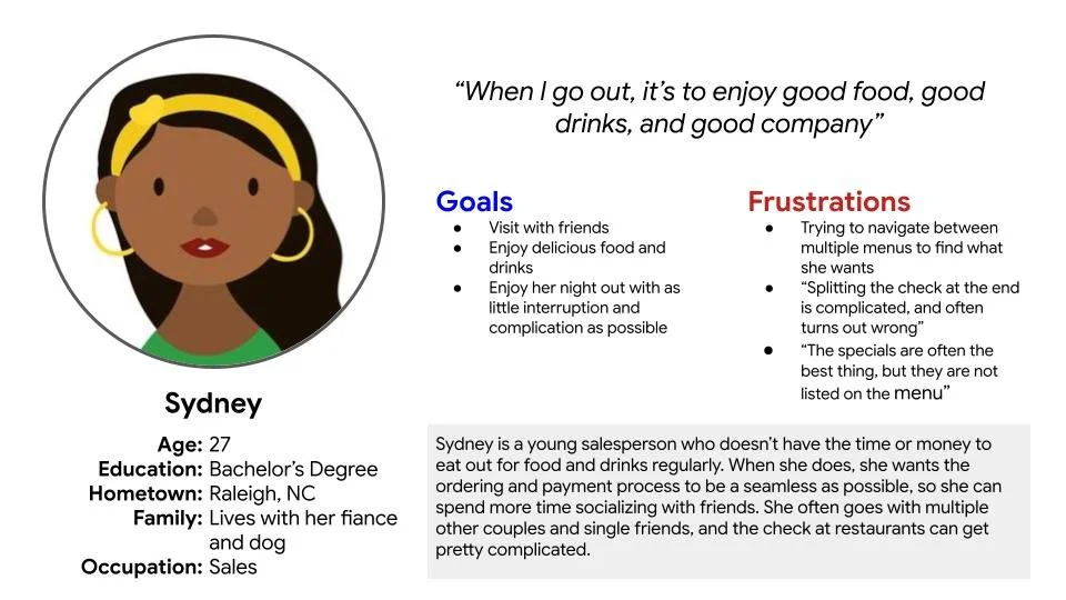
Trying to find both a food and drink to order, navigating between multiple menus or scrolling long distances
1
Difficulty communicating to server who should be put on which check
2
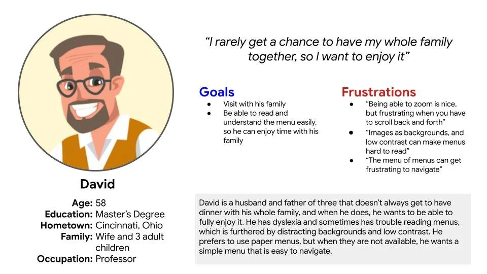
Distracting backgrounds and low contrast on menus, making them hard to read
3
Specials are not included on the menu, meaning decisions can’t be made until talking to the server
4
Personas
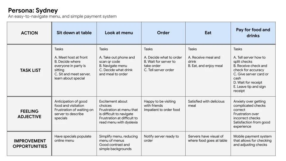
User Journey Map
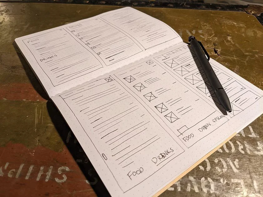
Paper Wireframes
I created many versions of each of the main pages of the app in order to find out what worked well and what didn’t. I combined the best aspects of these into the final design for each frame.
Low Fidelity Wireframes
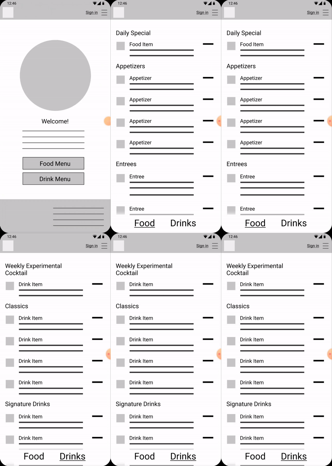
My research showed that a major frustration was navigating between multiple menus, or scrolling long distances to choose a food and drink. A navigation bar at the bottom allows users to quickly swap between menus, either clicking or swiping to change menus.
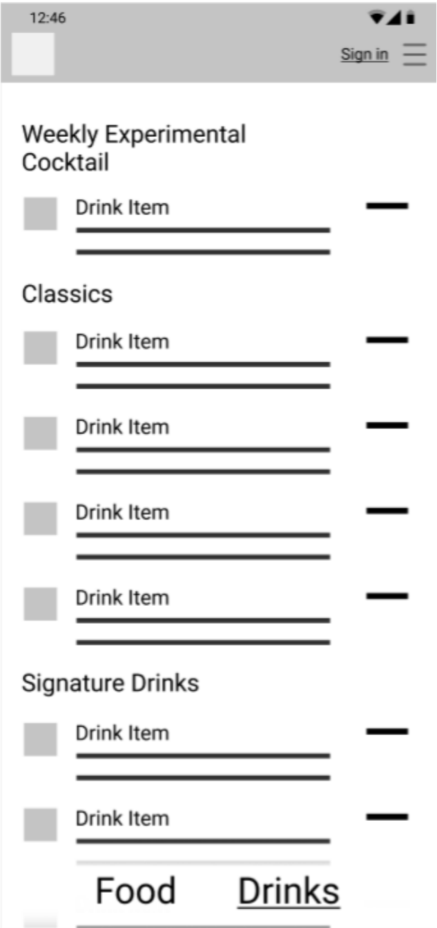
Icons to the side show the type of glassware to indicate the style of drink
Bottom navigation bar allows user to quickly switch between food and drink menu
Weekly specials are prioritized at top of screen, and easily updated
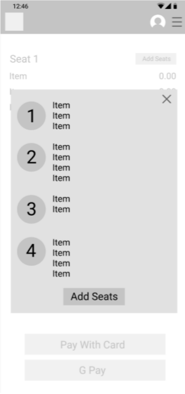
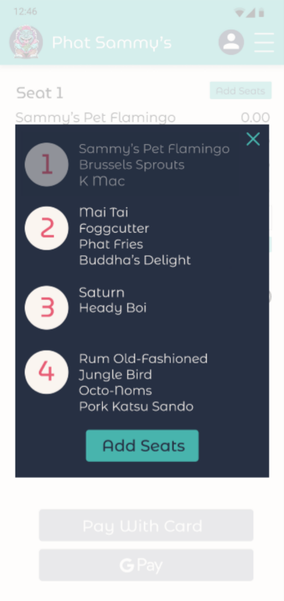
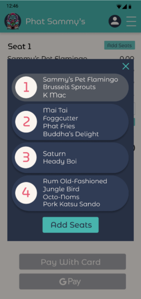
Seat selection screen allows you to add other seats to your check
List of items purchased by each seat prevents confusion
Prototype
From there, I created a prototype to refine the design and perform usability testing.
Usability Studies
The menu icon was hard to press
Users could not tell if they were logged in, leading to frustration of card being saved
Buttons need to be more consistent to indicate function
Round 1 Findings
The menu icon was hard to press
Users could not tell if they were logged in, leading to frustration of card being saved
Round 2 Findings
Adjustments
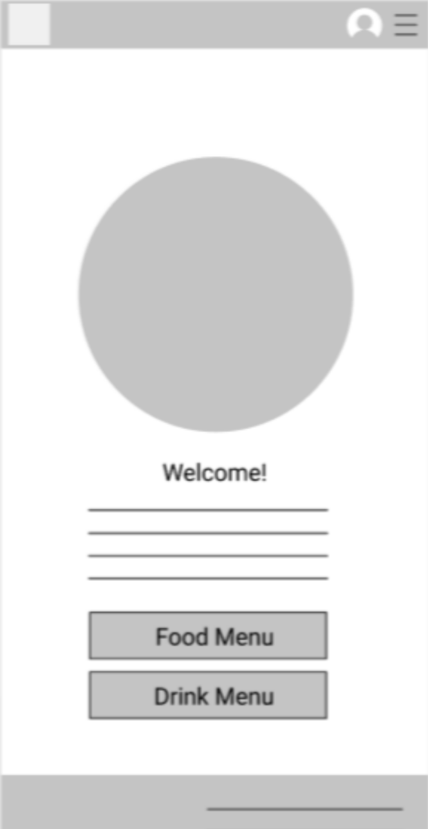
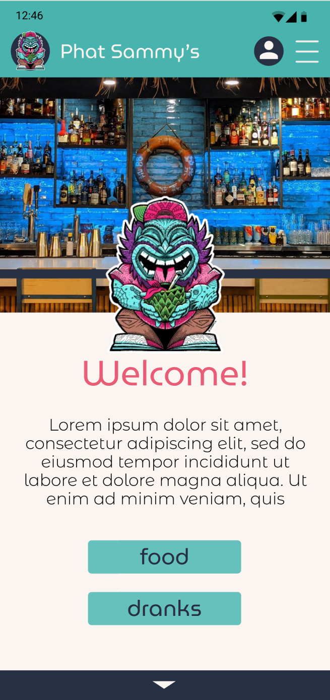
The menu icon is increased in size and moved lower as some phone screen’s fillets made it hard to reach. In addition, an arrow was added at the bottom to indicate there is more content below the fold.
It was not clear to all users that the seats were selectable. The new version incorporates a more button-like design, utilizing a border and drop shadow.
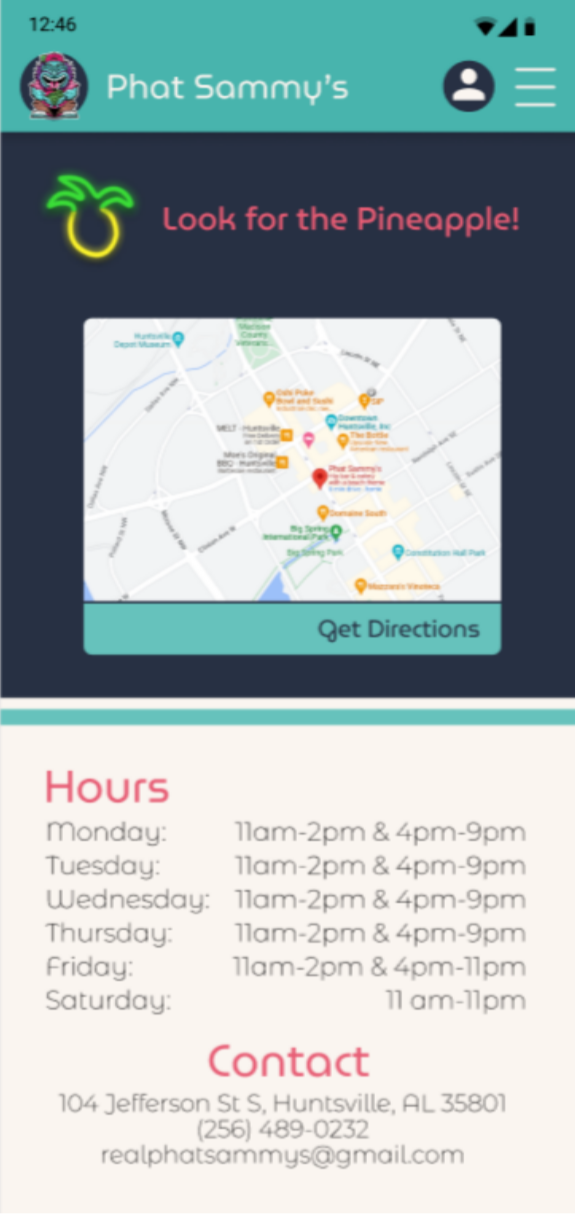
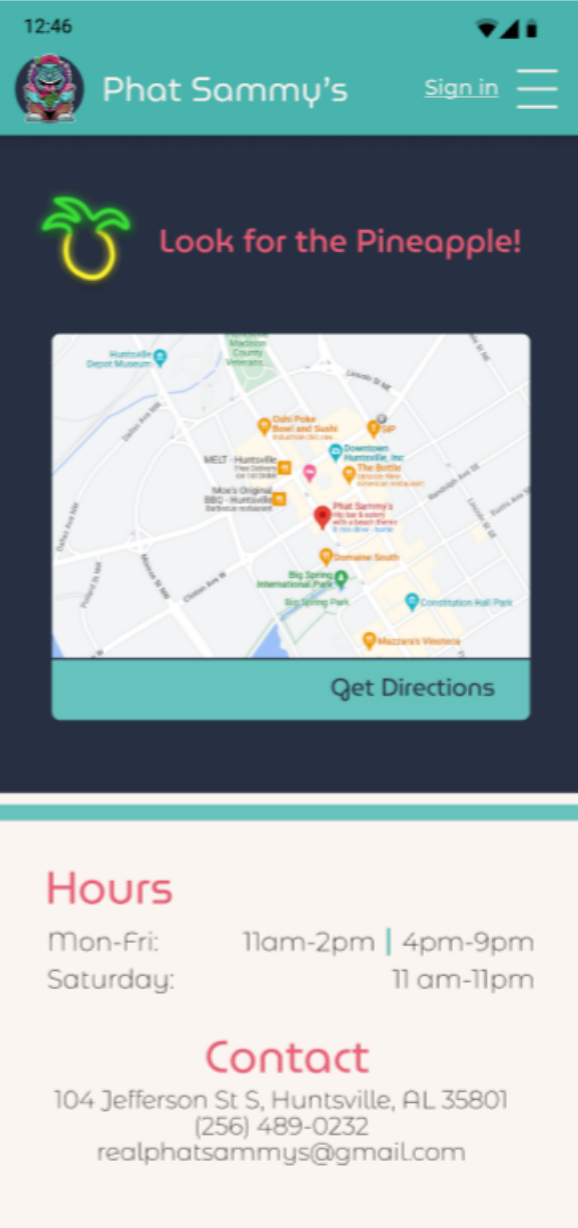
Hours of operation were condensed to make it clearer and less visually cluttered. The vertical line in place of the ampersand visually separates the morning and evening hours to find relevant hours more easily.
Before Usability Studies
After Usability Studies
Prototype
After several rounds of research and revisions, I created a final prototype. Take a look and please reach out if you have any questions.